
When we limit ourselves to a single colour palette in food photography, something magical happens. Monochromatic photography—using variations of just one hue—creates images that are visually cohesive, emotionally powerful, and deeply memorable. By working within the constraint of a single colour family, we amplify our storytelling and create mood in ways that multi-colored compositions simply cannot achieve.
Why Monochrome Matters in Food Photography

Monochromatic photography uses one colour in various shades, tints, and tones throughout the entire composition. This means your food, props, background, and styling all exist within the same colour family. A monochromatic blue image might feature blueberries on a slate-blue plate against a powder-blue backdrop with navy linen. Everything harmonises within that single colour story.
This approach is different from simply photographing a red apple. True monochromatic photography considers every element in the frame, creating a complete colour harmony that feels intentional and immersive.
The Psychology of Colour in Food Photography
Every colour carries emotional weight and cultural associations. When we commit to a monochromatic palette, we're not just making an aesthetic choice—we're telling a specific story.

Red: Passion, Energy, and Appetite
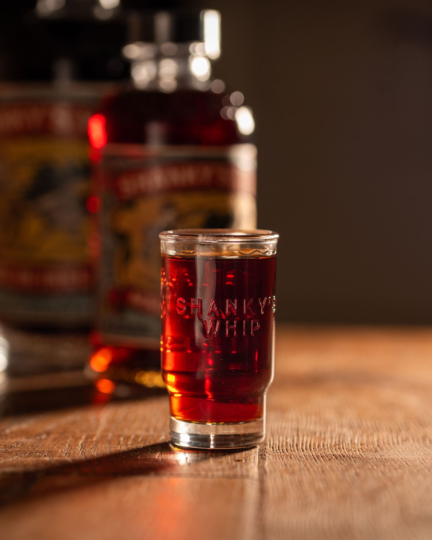
Red is the colour of desire and intensity. In food photography, monochromatic red compositions stimulate appetite and create a sense of indulgence.
Picture a chia pudding layered with vibrant raspberry compote, served in a red ceramic bowl on a crimson linen napkin, with fresh raspberries scattered across a terracotta surface. Everything from the dish to the backdrop unified in shades of red—from soft pink-reds to deep burgundy.
Red tells stories of summer abundance, romantic dinners, bold flavours, and celebration. It's passionate, unapologetic, and demands attention. Use red when you want your images to feel alive, energetic, and crave-worthy.

Pink: Softness, Romance, and Playfulness
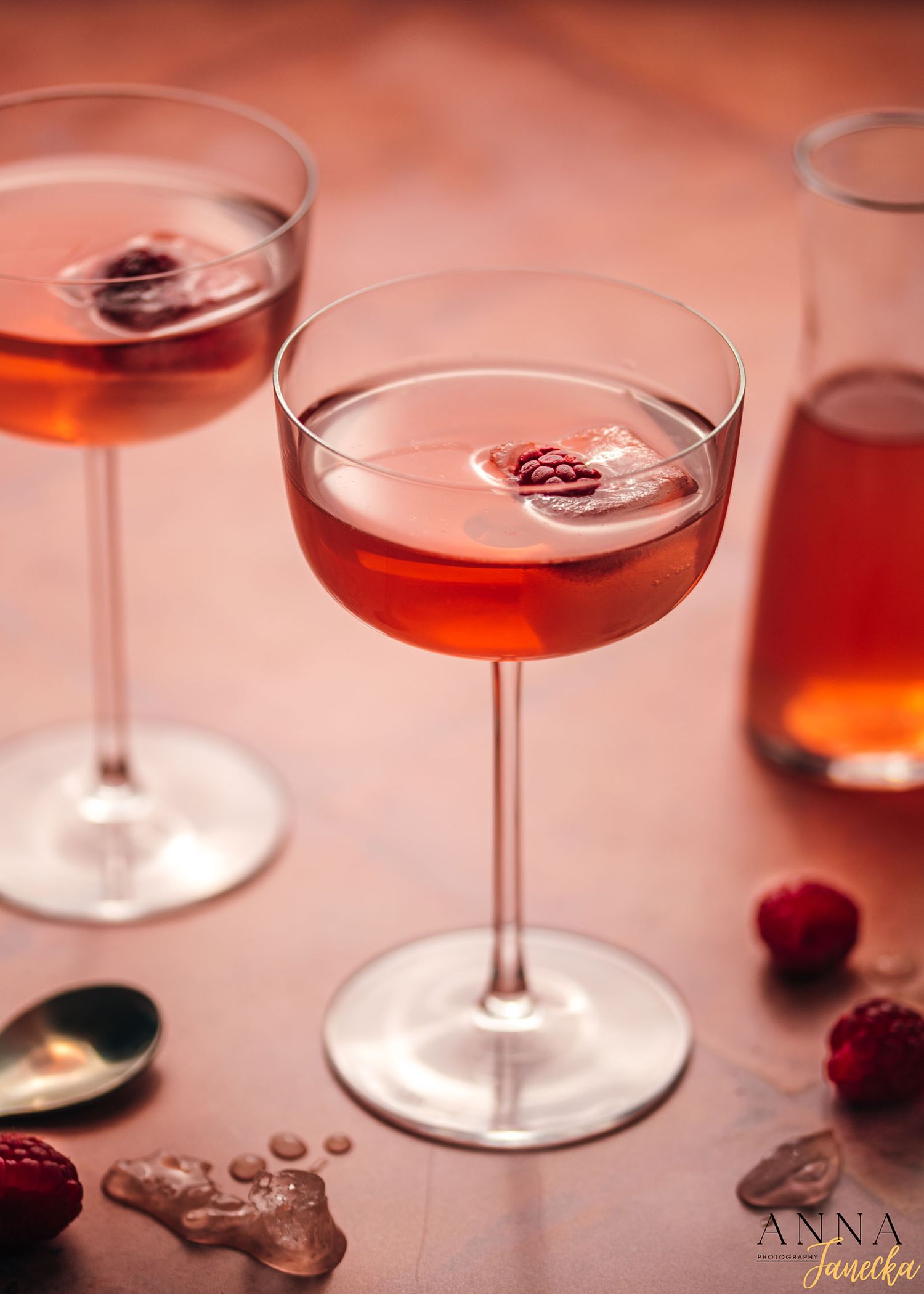
From blush to magenta, pink creates distinctly feminine or whimsical compositions. Imagine a soft pink cocktail in a delicate rose-tinted glass, garnished with pink grapefruit and edible flowers, set against a blush-pink backdrop with pale pink silk ribbons trailing across the scene. Rose wine, berries, beets, radicchio, and salmon offer surprising variety within this palette.
Pink tells stories of romance, sweetness, and playful femininity. It can be sophisticated or fun, delicate or bold, depending on the shade. Pink works beautifully for desserts, Valentine's Day, spring themes, or creating Instagram-worthy moments.
Green: Nature, Health, and Vitality
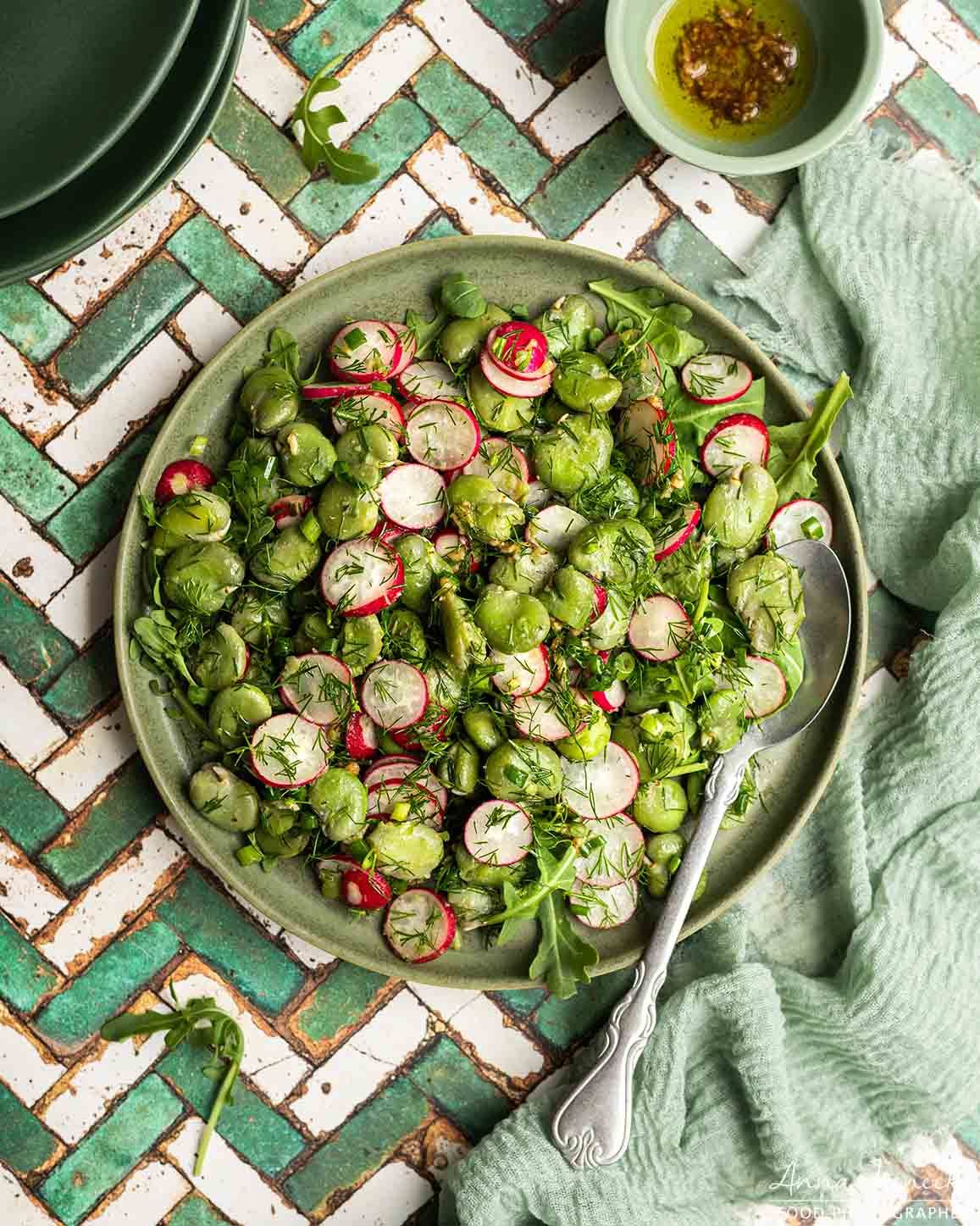
Green is the colour of life itself. Monochromatic green compositions feel inherently healthy, fresh, and connected to nature. Envision a crisp green salad with various shades of lettuce, herbs, cucumber, and avocado, arranged on sage-green plates atop an olive-toned wooden board, with forest-green napkins completing the scene. From deep forest greens to bright lime and soft sage, this palette offers incredible versatility.
Green tells stories of garden-to-table freshness, wellness, spring renewal, and natural living. It reassures viewers about nutrition and wholesomeness. Herbs, leafy vegetables, green fruits, and natural props like wooden boards or stone create compositions that feel grounded and nurturing.
Yellow/Orange: Warmth, Comfort, and Joy
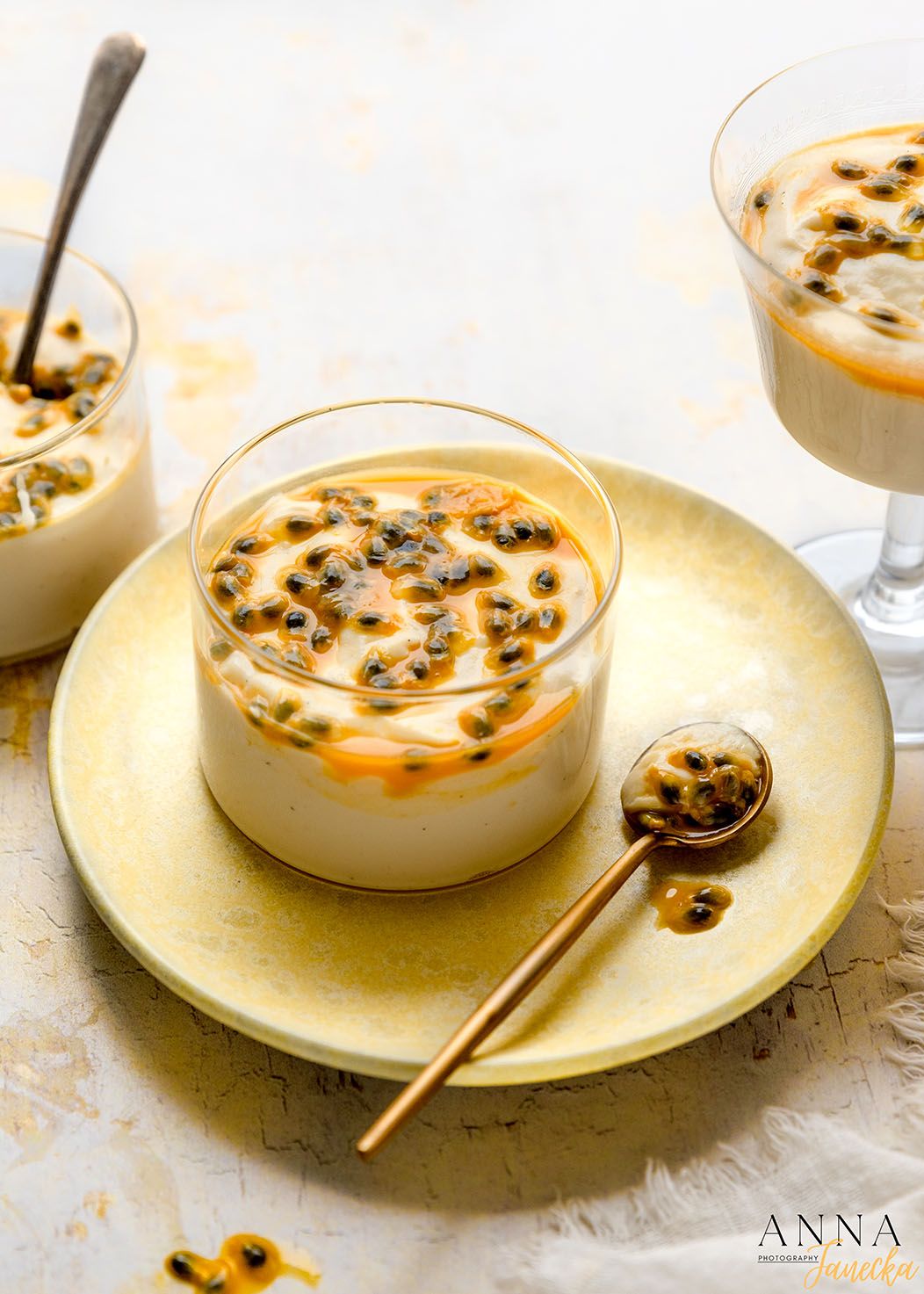
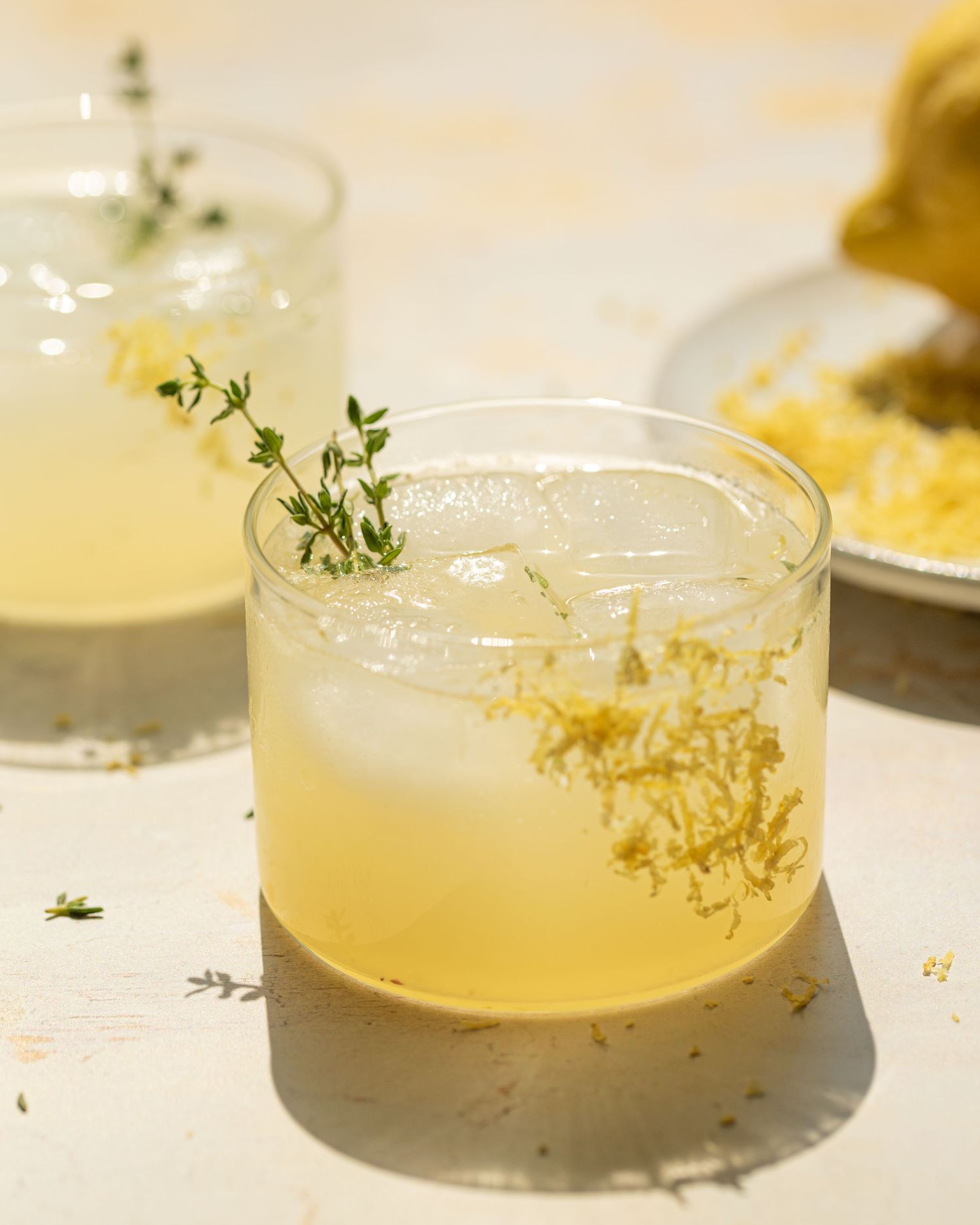
The warm spectrum from pale yellow through golden tones to deep orange radiates happiness and comfort. Imagine a creamy vanilla pudding topped with fresh yellow passion fruit, styled on golden yellow plates with honey-toned napkins and brass cutlery—everything bathed in warm, sun-drenched light. Citrus fruits, golden baked goods, turmeric, saffron, corn, and squash create similarly luminous compositions.
Yellow and orange tell stories of sunshine, optimism, comfort food, and harvest abundance. These colors feel welcoming and cheerful, perfect for breakfast scenes, autumnal themes, or cozy comfort food. They evoke warmth both literally and emotionally.
White/Cream: Purity, Elegance, and Minimalism
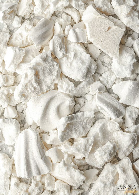
Monochromatic white and cream palettes feel refined and sophisticated. Picture crushed meringue with its crispy shards and soft peaks, arranged on white porcelain with cream-colored linens and a pale ivory backdrop—the varied textures of the meringue creating visual interest within the monochromatic palette. White dishes, pale foods like cauliflower or white fish, and light backgrounds create similarly airy, elegant compositions.
White tells stories of simplicity, purity, and understated luxury. It feels clean, modern, and allows subtle textures and forms to take center stage. This palette works beautifully for minimalist aesthetics, dairy products, baked goods, and fine dining presentations.

Brown/Neutral: Earthiness, Craft, and Authenticity
From caramel to espresso, brown evokes warmth, comfort, and rustic elegance. Picture a golden-crusted apple pie cooling in a weathered wooden tray, its filling rich with cinnamon and baked apples, surrounded by earthenware mugs of spiced coffee. A backdrop of burlap and linen, with accents of dried wheat and polished walnut, enhances the cosy atmosphere. Chocolate, chestnuts, pecans, mushrooms, and artisan breads reveal the depth and richness of this palette, bringing grounding and homely charm to any composition.
Brown tells stories of artisanal craft, rustic cooking, comfort, and timelessness. It feels honest and substantial, perfect for baking, coffee culture, or showcasing traditional techniques. These earthy tones create warmth without the brightness of orange or yellow.
Blue: Calm, Freshness, and the Unexpected
Blue is rare in natural foods, making monochromatic blue compositions particularly striking and contemporary. Blueberries, blue corn, purple cabbage, and blue-hued props create an ethereal, almost otherworldly aesthetic.
Blue tells stories of coolness, tranquillity, and sophistication. It feels fresh, clean, and modern. Because blue is uncommon in food, it creates intrigue and makes viewers pause. It's perfect for conveying freshness, oceanic themes, or a contemporary, artistic approach to food.
Purple: Luxury, Mystery, and Creativity
Purple has historically been associated with royalty and luxury. Eggplant, purple potatoes, figs, blackberries, and purple cabbage create rich, mysterious compositions.
Purple tells stories of indulgence, creativity, and the exotic. It feels both sophisticated and slightly unconventional, perfect for standing out and creating memorable, artistic images.
Creating Effective Monochromatic Compositions
Vary Your Tones
The key to successful monochromatic photography is using a range of tones within your chosen colour. Don't make everything the same exact shade. Include:
- Highlights: Lighter tints of your colour
- Midtones: Your core colour at full saturation
- Shadows: Deeper, darker versions
This tonal variety creates depth and prevents your image from feeling flat or monotonous.
Play with Texture
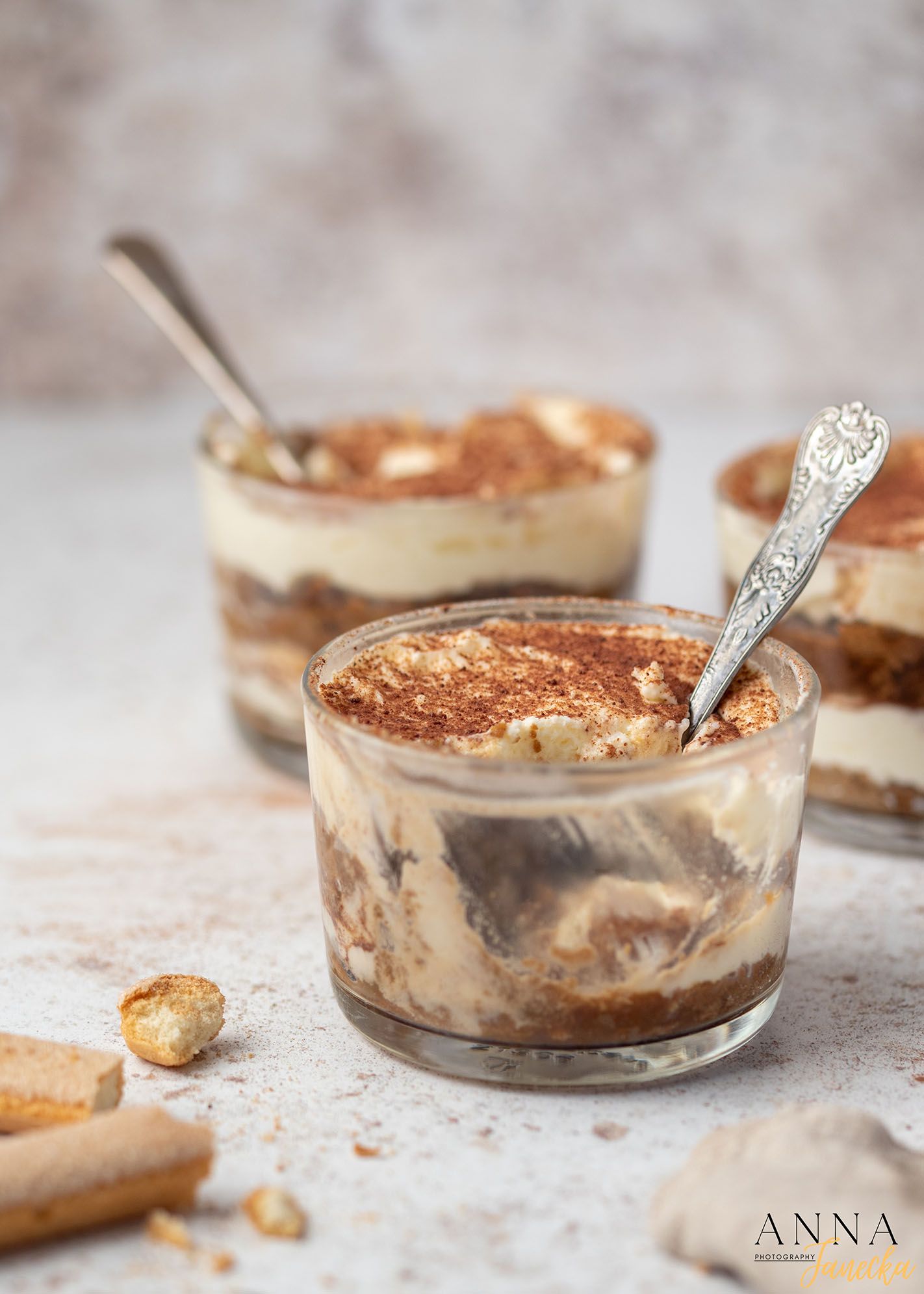
When colour variety is limited, texture becomes crucial for visual interest. Combine smooth and rough, matte and glossy, soft and crisp. A monochromatic composition with varied textures feels rich and engaging.

Use Natural Materials
Props in natural materials like wood, stone, linen, and ceramic often have subtle colour variations that read as monochromatic while adding organic interest to your palette.
Practical Tips for Shooting Monochromatic
Plan Your Palette
Monochromatic photography requires more pre-planning than typical food photography. Source ingredients, props, and backgrounds that all work within your chosen colour family before your shoot.
Watch Your Lighting
Lighting affects colour temperature. Warm light will shift cool colours, and cool light will affect warm colours. Be consistent with your light source to maintain colour harmony.
Edit with Intention
In post-processing, use HSL sliders to fine-tune your colour harmony. You can shift slightly off-palette colours to better match your intended monochrome while maintaining natural-looking results.
Don't Be Too Rigid
Perfect monochromatic purity isn't always necessary. A 90% commitment to your colour story with subtle variations often feels more natural and achievable than absolute uniformity.
When to Choose Monochromatic
Monochromatic compositions work beautifully when:
- You want to evoke a specific mood or emotion
- Creating a cohesive series or themed content
- The colour itself is part of the story (like a green smoothie for health content)
- You're working with seasonal ingredients that naturally share a palette
- You want images that feel designed and intentional
- Creating strong brand identity through consistent colour stories

The Challenge and Reward
Working monochromatically is both a constraint and a creative catalyst. It forces us to think more carefully about every element we include, to see beyond obvious colour combinations, and to let colour become a storytelling tool rather than just a visual element.
The result? Images that stop the scroll, convey mood instantly, and stay with viewers long after they've moved on.
Colour is one of the most powerful tools in a food photographer's arsenal. When we harness the full potential of a single colour family, we create images that don't just show food—they tell stories, evoke emotions, and create unforgettable visual experiences.